react-native 之佈局篇
寬度單位和像素密度
react的寬度不支持百分比,設置寬度時不須要帶單位 {width: 10}, 那麼10表明的具體寬度是多少呢? javascript
不知道是官網文檔不全仍是我眼瞎,反正是沒找到,那作一個實驗本身找吧:css
var Dimensions = require('Dimensions');
    <Text style={styles.welcome}>
          window.width={Dimensions.get('window').width + '\n'}
          window.height={Dimensions.get('window').height + '\n'}
          pxielRatio={PixelRatio.get()}
    </Text>
默認用的是ihone6的模擬器結果是:html
window.width=375
    window.height=667
咱們知道iphone系列的尺寸以下圖:java

能夠看到iphone 6的寬度爲 375pt,對應了上邊的375,實際上官文指出的單位爲 dp 。 那如何獲取實際的像素尺寸呢? 這對圖片的高清化很重要,若是個人圖片大小爲100100 px. 設置寬度爲100 100. 那在iphone上的尺寸就是模糊的。 這個時候須要的圖像大小應該是 100 * pixelRatio的大小 。 react
react 提供了PixelRatio 的獲取方式https://facebook.github.io/react-native/docs/pixelratio.htmlgit
var image = getImage({
   width: 200 * PixelRatio.get(),
   height: 100 * PixelRatio.get()
 });
 <Image source={image} style={{width: 200, height: 100}} />
flex的佈局
默認寬度
咱們知道一個div若是不設置寬度,默認的會佔用100%的寬度, 爲了驗證100%這個問題, 作三個實驗github
根節點上方一個View, 不設置寬度react-native
固定寬度的元素上設置一個View, 不設置寬度app
flex的元素上放一個View寬度, 不設置寬度iphone
<Text style={[styles.text, styles.header]}>
      根節點上放一個元素,不設置寬度
  </Text>

  <View style={{height: 20, backgroundColor: '#333333'}} />

  <Text style={[styles.text, styles.header]}>
      固定寬度的元素上放一個View,不設置寬度
  </Text>

  <View style={{width: 100}}>
    <View style={{height: 20, backgroundColor: '#333333'}} />
  </View>

  <Text style={[styles.text, styles.header]}>
      flex的元素上放一個View,不設置寬度
  </Text>

  <View style={{flexDirection: 'row'}}>
    <View style={{flex: 1}}>
      <View style={{height: 20, backgroundColor: '#333333'}} />
    </View>
    <View style={{flex: 1}}/>
  </View>
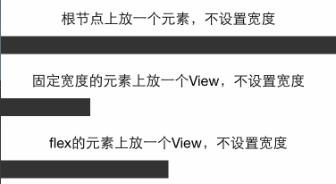
結果能夠看到flex的元素若是不設置寬度, 都會百分之百的佔滿父容器。
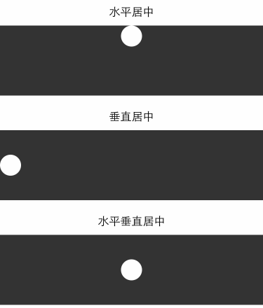
水平垂直居中
css 裏邊常常會作的事情是去講一個文本或者圖片水平垂直居中,若是使用過css 的flexbox固然知道使用alignItems 和 justifyContent . 那用react-native也來作一下實驗
<Text style={[styles.text, styles.header]}>
        水平居中
    </Text>

    <View style={{height: 100, backgroundColor: '#333333', alignItems: 'center'}}>
      <View style={{backgroundColor: '#fefefe', width: 30, height: 30, borderRadius: 15}}/>
    </View>

     <Text style={[styles.text, styles.header]}>
        垂直居中
    </Text>
    <View style={{height: 100, backgroundColor: '#333333', justifyContent: 'center'}}>
      <View style={{backgroundColor: '#fefefe', width: 30, height: 30, borderRadius: 15}}/>
    </View>

    <Text style={[styles.text, styles.header]}>
        水平垂直居中
    </Text>
    <View style={{height: 100, backgroundColor: '#333333', alignItems: 'center', justifyContent: 'center'}}>
      <View style={{backgroundColor: '#fefefe', width: 30, height: 30, borderRadius: 15}}/>
    </View>
網格佈局
網格佈局實驗, 網格佈局可以知足絕大多數的平常開發需求,因此只要知足網格佈局的spec,那麼就能夠證實react的flex佈局可以知足正常開發需求
等分的網格
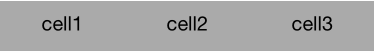
<View style={styles.flexContainer}>
      <View style={styles.cell}>
        <Text style={styles.welcome}>
          cell1
        </Text>
      </View>
      <View style={styles.cell}>
        <Text style={styles.welcome}>
          cell2
        </Text>
      </View>
      <View style={styles.cell}>
        <Text style={styles.welcome}>
          cell3
        </Text>
      </View>
    </View>

    styles = {
        flexContainer: {
            // 容器須要添加direction才能變成讓子元素flex
            flexDirection: 'row'
        },
        cell: {
            flex: 1,
            height: 50,
            backgroundColor: '#aaaaaa'
        },
        welcome: {
            fontSize: 20,
            textAlign: 'center',
            margin: 10
        },
    }
左邊固定, 右邊固定,中間flex的佈局
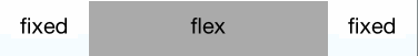
<View style={styles.flexContainer}>
      <View style={styles.cellfixed}>
        <Text style={styles.welcome}>
          fixed
        </Text>
      </View>
      <View style={styles.cell}>
        <Text style={styles.welcome}>
          flex
        </Text>
      </View>
      <View style={styles.cellfixed}>
        <Text style={styles.welcome}>
          fixed
        </Text>
      </View>
    </View>

    styles = {
        flexContainer: {
            // 容器須要添加direction才能變成讓子元素flex
            flexDirection: 'row'
        },
        cell: {
            flex: 1,
            height: 50,
            backgroundColor: '#aaaaaa'
        },
        welcome: {
            fontSize: 20,
            textAlign: 'center',
            margin: 10
        },
        cellfixed: {
            height: 50,
            width: 80,
            backgroundColor: '#fefefe'
        }
    }
嵌套的網格
一般網格不是一層的,佈局容器都是一層套一層的, 因此必須驗證在real world下面的網格佈局
<Text style={[styles.text, styles.header]}>
    嵌套的網格
  </Text>
  <View style={{flexDirection: 'row', height: 200, backgroundColor:"#fefefe", padding: 20}}>
    <View style={{flex: 1, flexDirection:'column', padding: 15, backgroundColor:"#eeeeee"}}>
        <View style={{flex: 1, backgroundColor:"#bbaaaa"}}>
        </View>
        <View style={{flex: 1, backgroundColor:"#aabbaa"}}>
        </View>
    </View>
    <View style={{flex: 1, padding: 15, flexDirection:'row', backgroundColor:"#eeeeee"}}>
        <View style={{flex: 1, backgroundColor:"#aaaabb"}}>
            <View style={{flex: 1, flexDirection:'row', backgroundColor:"#eeaaaa"}}>
               <View style={{flex: 1, backgroundColor:"#eebbaa"}}>
              </View>
              <View style={{flex: 1, backgroundColor:"#bbccee"}}>
              </View>
            </View>
            <View style={{flex: 1, backgroundColor:"#eebbdd"}}>
            </View>
        </View>
        <View style={{flex: 1, backgroundColor:"#aaccaa"}}>
          <ScrollView style={{flex: 1, backgroundColor:"#bbccdd", padding: 5}}>
                <View style={{flexDirection: 'row', height: 50, backgroundColor:"#fefefe"}}>
                  <View style={{flex: 1, flexDirection:'column', backgroundColor:"#eeeeee"}}>
                      <View style={{flex: 1, backgroundColor:"#bbaaaa"}}>
                      </View>
                      <View style={{flex: 1, backgroundColor:"#aabbaa"}}>
                      </View>
                  </View>
                  <View style={{flex: 1, flexDirection:'row', backgroundColor:"#eeeeee"}}>
                      <View style={{flex: 1, backgroundColor:"#aaaabb"}}>
                          <View style={{flex: 1, flexDirection:'row', backgroundColor:"#eeaaaa"}}>
                             <View style={{flex: 1, backgroundColor:"#eebbaa"}}>
                            </View>
                            <View style={{flex: 1, backgroundColor:"#bbccee"}}>
                            </View>
                          </View>
                          <View style={{flex: 1, backgroundColor:"#eebbdd"}}>
                          </View>
                      </View>
                      <View style={{flex: 1, backgroundColor:"#aaccaa"}}>
                      </View>
                  </View>
                </View>
                <Text style={[styles.text, styles.header, {color: '#ffffff', fontSize: 12}]}>
                  {(function(){
                    var str = '';
                    var n = 100;
                    while(n--) {
                      str += '嵌套的網格' + '\n';
                    }
                    return str;
                  })()}
                </Text>
          </ScrollView>
        </View>
    </View>
  </View>
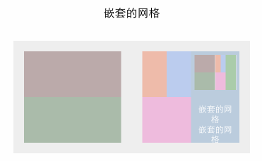
好在沒被我玩兒壞,能夠看到上圖的嵌套關係也是足夠的複雜的,(我還加了一個ScrollView,而後再嵌套整個結構)嵌套多層的佈局是沒有問題的。
圖片佈局
首先咱們得知道圖片有一個stretchMode. 經過Image.resizeMode訪問
找出有哪些mode
var keys = Object.keys(Image.resizeMode).join(' ');
打印出來的是 contain, cover, stretch 這幾種模式, (官方文檔不知道爲何不直接給出)
嘗試使用這些mode
<Text style={styles.welcome}> 100px height </Text>
  <Image style={{height: 100}} source={{uri: 'http://gtms03.alicdn.com/tps/i3/TB1Kcs5GXXXXXbMXVXXutsrNFXX-608-370.png'}} />

100px 高度, 能夠看到圖片適應100高度和全屏寬度,背景居中適應未拉伸可是被截斷也就是cover。
<Text style={styles.welcome}> 100px height with resizeMode contain </Text>
  <View style={[{flex: 1, backgroundColor: '#fe0000'}]}>
      <Image style={{flex: 1, height: 100, resizeMode: Image.resizeMode.contain}} source={{uri: 'http://gtms03.alicdn.com/tps/i3/TB1Kcs5GXXXXXbMXVXXutsrNFXX-608-370.png'}} />
  </View>
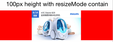
contain 模式容器徹底容納圖片,圖片自適應寬高
<Text style={styles.welcome}> 100px height with resizeMode cover </Text>
  <View style={[{flex: 1, backgroundColor: '#fe0000'}]}>
      <Image style={{flex: 1, height: 100, resizeMode: Image.resizeMode.cover}} source={{uri: 'http://gtms03.alicdn.com/tps/i3/TB1Kcs5GXXXXXbMXVXXutsrNFXX-608-370.png'}} />
  </View>
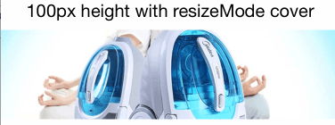
cover模式同100px高度模式
<Text style={styles.welcome}> 100px height with resizeMode stretch </Text>
  <View style={[{flex: 1, backgroundColor: '#fe0000'}]}>
      <Image style={{flex: 1, height: 100, resizeMode: Image.resizeMode.stretch}} source={{uri: 'http://gtms03.alicdn.com/tps/i3/TB1Kcs5GXXXXXbMXVXXutsrNFXX-608-370.png'}} />
  </View>

stretch模式圖片被拉伸適應屏幕
<Text style={styles.welcome}> set height to image container </Text>
  <View style={[{flex: 1, backgroundColor: '#fe0000', height: 100}]}>
      <Image style={{flex: 1}} source={{uri: 'http://gtms03.alicdn.com/tps/i3/TB1Kcs5GXXXXXbMXVXXutsrNFXX-608-370.png'}} />
  </View>
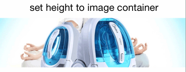
隨便試驗了一下, 發現高度設置到父容器,圖片flex的時候也會等同於cover模式
絕對定位和相對定位
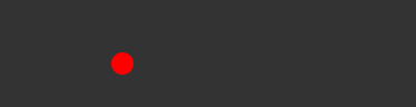
<View style={{flex: 1, height: 100, backgroundColor: '#333333'}}>
    <View style={[styles.circle, {position: 'absolute', top: 50, left: 180}]}>
    </View>
  </View>
  styles = {
    circle: {
    backgroundColor: '#fe0000',
    borderRadius: 10,
    width: 20,
    height: 20
    }
  }
和css的標準不一樣的是, 元素容器不用設置position:'absolute|relative' .
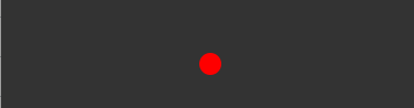
<View style={{flex: 1, height: 100, backgroundColor: '#333333'}}>
    <View style={[styles.circle, {position: 'relative', top: 50, left: 50, marginLeft: 50}]}>
    </View>
  </View>
相對定位的能夠看到很容易的配合margin作到了。 (我還擔憂不能配合margin,因此測試了一下:-:)
padding和margin
咱們知道在css中區分inline元素和block元素,既然react-native實現了一個超級小的css subset。那咱們就來實驗一下padding和margin在inline和非inline元素上的padding和margin的使用狀況。
padding
<Text style={[styles.text, styles.header]}>
    在正常的View上設置padding
  </Text>

  <View style={{padding: 30, backgroundColor: '#333333'}}>
    <Text style={[styles.text, {color: '#fefefe'}]}> Text Element</Text>
  </View>

  <Text style={[styles.text, styles.header]}>
    在文本元素上設置padding
  </Text>
  <View style={{padding: 0, backgroundColor: '#333333'}}>
    <Text style={[styles.text, {backgroundColor: '#fe0000', padding: 30}]}>
      text 元素上設置paddinga
    </Text>
  </View>
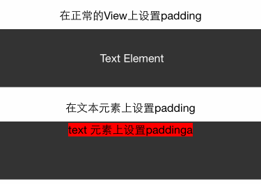
在View上設置padding很順利,沒有任何問題, 可是若是在inline元素上設置padding, 發現會出現上面的錯誤, paddingTop和paddingBottom都被擠成marginBottom了。 按理說,不該該對Text作padding處理, 可是確實有這樣的問題存在,因此能夠將這個問題mark一下。
margin
<Text style={[styles.text, styles.header]}>
    在正常的View上設置margin
  </Text>

  <View style={{backgroundColor: '#333333'}}>
    <View style={{backgroundColor: '#fefefe', width: 30, height: 30, margin: 30}}/>
  </View>

  <Text style={[styles.text, styles.header]}>
    在文本元素上設置margin
  </Text>
  <View style={{backgroundColor: '#333333'}}>
    <Text style={[styles.text, {backgroundColor: '#fe0000', margin: 30}]}>
      text 元素上設置margin
    </Text>
    <Text style={[styles.text, {backgroundColor: '#fe0000', margin: 30}]}>
      text 元素上設置margin
    </Text>
  </View>
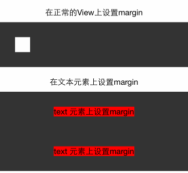
咱們知道,對於inline元素,設置margin-left和margin-right有效,top和bottom按理是不會生效的, 可是上圖的結果能夠看到,實際是生效了的。因此如今給個人感受是Text元素更應該理解爲一個不能設置padding的block。
算了不要猜了, 咱們看看官方文檔怎麼說Text,https://facebook.github.io/react-native/docs/text.html
<Text>
    <Text>First part and </Text>
    <Text>second part</Text>
  </Text>
  // Text container: all the text flows as if it was one
  // |First part |
  // |and second |
  // |part       |

  <View>
    <Text>First part and </Text>
    <Text>second part</Text>
  </View>
  // View container: each text is its own block
  // |First part |
  // |and        |
  // |second part|
也就是若是Text元素在Text裏邊,能夠考慮爲inline, 若是單獨在View裏邊,那就是Block。
下面會專門研究一下文本相關的佈局
文本元素
首先咱們得考慮對於Text元素咱們但願有哪些功能或者想驗證哪些功能:
文字是否能自動換行?
overflow ellipse?
是否能對部分文字設置樣式 ,相似span等標籤
先看看文字有哪些支持的style屬性
/*==========TEXT================*/
  Attributes.style = {
    color string
    containerBackgroundColor string
    fontFamily string
    fontSize number
    fontStyle enum('normal', 'italic')
    fontWeight enum("normal", 'bold', '100', '200', '300', '400', '500', '600', '700', '800', '900')
    lineHeight number
    textAlign enum("auto", 'left', 'right', 'center')
    writingDirection enum("auto", 'ltr', 'rtl')
  }
實驗1, 2, 3
<Text style={[styles.text, styles.header]}>
      文本元素
  </Text>

  <View style={{backgroundColor: '#333333', padding: 10}}>
    <Text style={styles.baseText} numberOfLines={5}>
      <Text style={styles.titleText} onPress={this.onPressTitle}>
        文本元素{'\n'}
      </Text>
      <Text>
        {'\n'}In this example, the nested title and body text will inherit the fontFamily from styles.baseText, but the title provides its own additional styles. The title and body will stack on top of each other on account of the literal newlines, numberOfLines is Used to truncate the text with an elipsis after computing the text layout, including line wrapping, such that the total number of lines does not exceed this number.
      </Text>
    </Text>
  </View>
  styles = {
    baseText: {
      fontFamily: 'Cochin',
      color: 'white'
    },
    titleText: {
      fontSize: 20,
      fontWeight: 'bold',
    }
  }
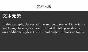
從結果來看1,2,3獲得驗證。 可是不知道各位有沒有發現問題, 爲何底部空出了這麼多空間, 沒有設置高度啊。 我去除numberOfLines={5} 這行代碼,效果以下:
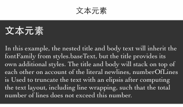
因此實際上, 那段空間是文本撐開的, 可是文本被numberOfLines={5} 截取了,可是剩餘的空間還在。 我猜這應該是個bug。
其實官方文檔裏邊把numberOfLines={5}這句放到的是長文本的Text元素上的,也就是子Text上的。 實際結果是不生效。 這應該又是一個bug。
Text元素的子Text元素的具體實現是怎樣的, 感受這貨會有不少bug, 看官文
<Text style={{fontWeight: 'bold'}}>
  I am bold
  <Text style={{color: 'red'}}>
    and red
  </Text>
 </Text>
Behind the scenes, this is going to be converted to a flat
NSAttributedString that contains the following information
"I am bold and red"
  0-9: bold
  9-17: bold, red
好吧, 那對於numberOfLines={5} 放在子Text元素上的那種bug卻是能夠解釋了。
Text的樣式繼承
實際上React-native裏邊是沒有樣式繼承這種說法的, 可是對於Text元素裏邊的Text元素,上面的例子能夠看出存在繼承。 那既然有繼承,問題就來了!
究竟是繼承的最外層的Text的值呢,仍是繼承父親Text的值呢?
<Text style={[styles.text, styles.header]}>
      文本樣式繼承
  </Text>

  <View style={{backgroundColor: '#333333', padding: 10}}>
    <Text style={{color: 'white'}}>
      <Text style={{color: 'red'}} onPress={this.onPressTitle}>
         文本元素{'\n'}
        <Text>我是white仍是red呢?{'\n'} </Text>
      </Text>
      <Text>我應該是white的</Text>
    </Text>
  </View>
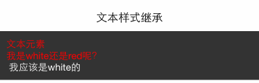
結果可見是直接繼承父親Text的。
總結
react 寬度基於
pt爲單位, 能夠經過Dimensions來獲取寬高,PixelRatio獲取密度。-
基於flex的佈局
view默認寬度爲100%
水平居中用
alignItems, 垂直居中用justifyContent基於flex可以實現現有的網格系統需求,且網格可以各類嵌套無bug
-
圖片佈局
經過
Image.resizeMode來適配圖片佈局,包括contain,cover,stretch默認不設置模式等於cover模式
contain模式自適應寬高,給出高度值便可
cover鋪滿容器,可是會作截取
stretch鋪滿容器,拉伸
-
定位
定位相對於父元素,父元素不用設置position也行
padding 設置在Text元素上的時候會存在bug。全部padding變成了marginBottom
-
文本元素
文字必須放在Text元素裏邊
Text元素能夠相互嵌套,且存在樣式繼承關係
numberOfLines須要放在最外層的Text元素上,且雖然截取了文字可是仍是會佔用空間
- 1. ReactNative FlexBox佈局
- 2. ReactNative 樣式佈局小結
- 3. reactnative佈局與適配
- 4. ExtJS之佈局篇
- 5. react-native 之佈局篇
- 6. react-native 佈局篇之flexbox
- 7. react-native 佈局篇之position
- 8. React-Native之flexbox佈局篇
- 9. css之佈局結構篇
- 10. ReactNative學習筆記1 Flexbox佈局
- 更多相關文章...
- • ASP.NET Web Pages - 頁面佈局 - ASP.NET 教程
- • ASP.NET MVC - 樣式和佈局 - ASP.NET 教程
- • 再有人問你分佈式事務,把這篇扔給他
- • JDK13 GA發佈:5大特性解讀
-
每一个你不满意的现在,都有一个你没有努力的曾经。
- 1. 字節跳動21屆秋招運營兩輪面試經驗分享
- 2. Java 3 年,25K 多嗎?
- 3. mysql安裝部署
- 4. web前端開發中父鏈和子鏈方式實現通信
- 5. 3.1.6 spark體系之分佈式計算-scala編程-scala中trait特性
- 6. dataframe2
- 7. ThinkFree在線
- 8. 在線畫圖
- 9. devtools熱部署
- 10. 編譯和鏈接