CSS教程: CSS(高級)
CSS(高級)javascript
CSS 動畫
Transform(變換)
2D 轉換
CSS3 2D轉換,咱們能夠斜拉(skew),縮放(scale),旋轉(rotate)以及位移(translate)元素。
注意: Internet Explorer 10, Firefox, 和 Opera支持transform 屬性。Chrome 和 Safari 要求前綴 -webkit- 版本。 Internet Explorer 9 要求前綴 -ms- 版本.
經常使用 2D 變換方法:css
- translate()
- rotate()
- scale()
- skew()
- matrix()
translate()
translate()方法,根據左(X軸)和頂部(Y軸)位置給定的參數,從當前元素位置移動html
.translate {
    transform: translate(50px, 100px);
    -ms-transform: translate(50px, 100px); /* IE 9 */
    -webkit-transform: translate(50px, 100px); /* Safari and Chrome */
}
rotate()
rotate()方法,在一個給定度數沿着元素中心順時針旋轉的元素。負值是容許的,這樣是元素逆時針旋轉。java
.rotate
{
    transform:rotate(30deg);
    -ms-transform:rotate(30deg); /* IE 9 */
    -webkit-transform:rotate(30deg); /* Safari and Chrome */
}
scale()
scale()方法,該元素增長或減小的大小,取決於寬度(X軸)和高度(Y軸)的參數:jquery
.scale
{
    transform: scale(2,4);
    -ms-transform: scale(2,4); /* IE 9 */
    -webkit-transform: scale(2,4); /* Safari and Chrome */
}
skew()
skew()方法,該元素會根據橫向(X軸)和垂直(Y軸)線參數給定角度:css3
.skew
{
    transform:skew(30deg,20deg);
    -ms-transform:skew(30deg,20deg); /* IE 9 */
    -webkit-transform:skew(30deg,20deg); /* Safari and Chrome */
}
以上幾種方法都有其各自的利弊,在實際應用中建議使用第一種和第四種,由於這兩種方法是在項目製做中是經常使用的方法,對於他們的具體區別skewX(30deg) 以下圖: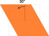
skewY(10deg) 以下圖: #
#
skew(30deg, 10deg) 以下圖:
git
matrix()
matrix()方法和2D變換方法合併成一個。
matrix 方法有六個參數,包含旋轉,縮放,移動(平移)和傾斜功能。github
.matrix
{
    transform:matrix(0.866,0.5,-0.5,0.866,0,0);
    -ms-transform:matrix(0.866,0.5,-0.5,0.866,0,0); /* IE 9 */
    -webkit-transform:matrix(0.866,0.5,-0.5,0.866,0,0); /* Safari and Chrome */
}
源碼
https://gitee.com/turingitclub/css-learning/blob/dev/base/2d_transform.html
web
3D 轉換
CSS3 3D Transform,用於 3 維動畫或旋轉。
CSS3 3D 轉換是一個屬性,用於改變元素的實際形式。這個特性能夠改變元素的形狀、大小和位置。
主要有下列方法:算法
- rotateX()
- rotateY()
- rotateZ()
注意:Internet Explorer 10 和 Firefox 支持 3D 轉換; Chrome 和 Safari 必須添加前綴 -webkit-; Opera 還不支持 3D 轉換(支持 2D 轉換 ) otateX()
rotateX()方法,圍繞其在一個給定度數X軸旋轉的元素。
.rotate-x {
    transform: rotateX(60deg);
    -webkit-transform: rotateX(120deg); /* Safari and Chrome */
}
rotateY()
rotateY()方法,圍繞其在一個給定度數Y軸旋轉的元素。
.rotate-y {
    transform: rotateY(60deg);
    -webkit-transform: rotateY(120deg); /* Safari and Chrome */
}
rotateZ()
rotateZ()方法,圍繞其在一個給定度數Z軸旋轉的元素。
.rotate-z {
    transform: rotateZ(60deg);
    -webkit-transform: rotateY(120deg); /* Safari and Chrome */
}
rotate3d()
otate3d(x,y,z,a)中取值說明:
- x:是一個0到1之間的數值,主要用來描述元素圍繞X軸旋轉的矢量值;
- y:是一個0到1之間的數值,主要用來描述元素圍繞Y軸旋轉的矢量值;
- z:是一個0到1之間的數值,主要用來描述元素圍繞Z軸旋轉的矢量值;
- a:是一個角度值,主要用來指定元素在3D空間旋轉的角度,若是其值爲正值,元素順時針旋轉,反之元素逆時針旋轉。 面介紹的三個旋轉函數功能等同:
- rotateX(a)函數功能等同於rotate3d(1,0,0,a)
- rotateY(a)函數功能等同於rotate3d(0,1,0,a)
- rotateZ(a)函數功能等同於rotate3d(0,0,1,a)
例子
.rotate-3d {
    transform: rotate3d(0,0.6,0.2,60deg);
    -webkit-transform: rotate3d(0.6,0.6,0.2,60deg); /* Safari and Chrome */
}
轉換方法
| 函數 | 描述 |
|---|---|
| matrix3d(_n_,_n_,_n_,_n_,_n_,_n_, _n_,_n_,_n_,_n_,_n_,_n_,_n_,_n_,_n_,_n_) |
定義 3D 轉換,使用 16 個值的 4x4 矩陣。 |
| translate3d(_x_,_y_,_z_) | 定義 3D 轉化。 |
| translateX(_x_) | 定義 3D 轉化,僅使用用於 X 軸的值。 |
| translateY(_y_) | 定義 3D 轉化,僅使用用於 Y 軸的值。 |
| translateZ(_z_) | 定義 3D 轉化,僅使用用於 Z 軸的值。 |
| scale3d(_x_,_y_,_z_) | 定義 3D 縮放轉換。 |
| scaleX(_x_) | 定義 3D 縮放轉換,經過給定一個 X 軸的值。 |
| scaleY(_y_) | 定義 3D 縮放轉換,經過給定一個 Y 軸的值。 |
| scaleZ(_z_) | 定義 3D 縮放轉換,經過給定一個 Z 軸的值。 |
| rotate3d(_x_,_y_,_z_,_angle_) | 定義 3D 旋轉。 |
| rotateX(_angle_) | 定義沿 X 軸的 3D 旋轉。 |
| rotateY(_angle_) | 定義沿 Y 軸的 3D 旋轉。 |
| rotateZ(_angle_) | 定義沿 Z 軸的 3D 旋轉。 |
| perspective(_n_) | 定義 3D 轉換元素的透視視圖。 |
源碼
https://gitee.com/turingitclub/css-learning/blob/dev/base/3d_transform.html
[Transition(過渡)]()
CSS3 過渡是元素從一種樣式逐漸改變爲另外一種的效果。

https://codepen.io/AlexZ33/pen/KKwXLea
儘管 CSS3 過渡效果是足夠的過渡的一個元素,可是 text-transform 屬性能夠提升 CSS3 過渡效果的風格。
主要有四個屬性的CSS3轉換效果,已被描述以下:
注意:Internet Explorer 10, Firefox, Opera, Chrome, 和Opera 支持transition 屬性。Safari 須要前綴 -webkit-。Internet Explorer 9 以及更早的版本,不支持 transition 屬性。Chrome 25 以及更早的版本,須要前綴 -webkit-
transition-property
規定應用過渡的 CSS 屬性的名稱。
transition-property: all;
transition-property: none;
transition-property: background-color;
transition-property: background-color, height, width;
transition-duration
定義過渡效果花費的時間。默認是 0。 時間單位能夠是秒/毫秒。
transition-duration: 2s;
transition-duration: 1000ms;
transition-duration: 1000ms, 2000ms;
transition-timing-function
規定過渡效果的時間曲線。默認是 "ease"。
transition-timing-function: ease;
transition-timing-function: ease-in;
transition-timing-function: ease-in-out;
transition-timing-function: ease, linear;
transition-timing-function: cubic-bezier(1.000, 0.835, 0.000, 0.945);
其中:
- linear:線性過渡。等同於貝塞爾曲線(0.0, 0.0, 1.0, 1.0)
- ease:平滑過渡。等同於貝塞爾曲線(0.25, 0.1, 0.25, 1.0)
- ease-in:由慢到快。等同於貝塞爾曲線(0.42, 0, 1.0, 1.0)
- ease-out:由快到慢。等同於貝塞爾曲線(0, 0, 0.58, 1.0)
- ease-in-out:由慢到快再到慢。等同於貝塞爾曲線(0.42, 0, 0.58, 1.0)
- step-start:等同於 steps(1, start)
- step-end:等同於 steps(1, end)
- steps(
<integer>[, [ start | end ] ]?):接受兩個參數的步進函數。第一個參數必須爲正整數,指定函數的步數。第二個參數取值能夠是start或end,指定每一步的值發生變化的時間點。第二個參數是可選的,默認值爲end。 - cubic-bezier(
<number>, <number>, <number>, <number>):特定的貝塞爾曲線類型,4個數值需在[0, 1]區間內
https://codepen.io/AlexZ33/pen/KKwvWjg
注意,emmet語法。 我要生成下面的html結構,用的 div#wrapper>(p+div.progress-bar#bar$)*9 再按Tab鍵

transition-delay
規定過渡效果什麼時候開始。默認是 0。
transition-delay: 2s;
transition-delay: 1000ms, 2000ms;
transition-delay: -2s;
https://codepen.io/AlexZ33/pen/eYmBYmW
<!DOCTYPE html>
<html>
<head>
    <meta charset="utf-8">
    <title>過渡效果 | AlexZ33</title>
    <meta name="description" content="過渡效果">
    <meta name="author" content="AlexZ33"/>
    <meta name="viewport" content="width=device-width">
    <link rel="shortcut icon" href="/favicon.ico">

    <style>
        .example {
            width: 100px;
            height: 100px;
            background: red;
            transition-property: width;
            transition-duration: 1s;
            transition-timing-function: linear;
            transition-delay: 2s;
            /* Safari */
            -webkit-transition-property: width;
            -webkit-transition-duration: 1s;
            -webkit-transition-timing-function: linear;
            -webkit-transition-delay: 2s;
        }
        .example:hover {
            width: 200px;
        }
        #example {
            position: relative;
            width: 530px;
            height: 530px;
            margin: 0 auto 10px;
            padding: 10px;
        }
        .childbox {
            font-size: 12px;
            position: relative;
            width: 60px;
            height: 60px;
            margin-bottom: 10px;
            background-color: #ccc;
        }
        .childbox p {
            text-align: center;
            padding-top: 10px;
        }
        #ease.childbox {
            -webkit-transition: all 4s ease;
            -moz-transition: all 4s ease;
            -o-transition: all 4s ease;
            transition: all 4s ease;
            border: 1px solid #ff0000;
        }
        #ease_in.childbox {
            -webkit-transition: all 4s ease-in;
            -moz-transition: all 4s ease-in;
            -o-transition: all 4s ease-in;
            transition: all 4s ease-in;
            border: 1px solid #00ffff;
        }
        #ease_out.childbox {
            -webkit-transition: all 4s ease-out;
            -moz-transition: all 4s ease-out;
            -o-transition: all 4s ease-out;
            transition: all 4s ease-out;
            border: 1px solid #f5f5f5;
        }
        #ease_in_out.childbox {
            -webkit-transition: all 4s ease-in-out;
            -moz-transition: all 4s ease-in-out;
            -o-transition: all 4s ease-in-out;
            transition: all 4s ease-in-out;
            border: 1px solid #f209f3;
        }
        #linear.childbox {
            -webkit-transition: all 4s linear;
            -moz-transition: all 4s linear;
            -o-transition: all 4s linear;
            transition: all 4s linear;
            border: 1px solid #ddddff;
        }
        #custom.childbox {
            -webkit-transition: all 4s cubic-bezier(1.000, 0.835, 0.000, 0.945);
            -moz-transition: all 4s cubic-bezier(1.000, 0.835, 0.000, 0.945);
            -o-transition: all 4s cubic-bezier(1.000, 0.835, 0.000, 0.945);
            transition: all 4s cubic-bezier(1.000, 0.835, 0.000, 0.945);
            border: 1px solid #cfdf44;
        }
        #negative.childbox {
            -webkit-transition: all 4s cubic-bezier(1.000, -0.530, 0.405, 1.425);
            -moz-transition: all 4s cubic-bezier(1.000, -0.530, 0.405, 1.425);
            -o-transition: all 4s cubic-bezier(1.000, -0.530, 0.405, 1.425);
            transition: all 4s cubic-bezier(1.000, -0.530, 0.405, 1.425);
            border: 1px solid #000;
        }
        #steps-start.childbox {
            -webkit-transition: all 4s steps(4, start);
            -moz-transition: all 4s steps(4, start);
            -o-transition: all 4s steps(4, start);
            transition: all 4s steps(4, start);
            border: 1px solid #ff0;
        }
        #steps-end.childbox {
            -webkit-transition: all 4s steps(4, end);
            -moz-transition: all 4s steps(4, end);
            -o-transition: all 4s steps(4, end);
            transition: all 4s steps(4, end);
            border: 1px solid #0f0;
        }
        #example:hover .childbox, #example.hover_effect .childbox {
            -webkit-border-radius: 30px;
            -moz-border-radius: 30px;
            border-radius: 30px;
            -webkit-transform: rotate(720deg);
            -moz-transform: rotate(720deg);
            -o-transform: rotate(720deg);
            -ms-transform: rotate(720deg);
            transform: rotate(720deg);
            margin-left: 420px;
            background-color: #fff;
        }
    </style>

</head>
<body>
<p>鼠標移動到 div 元素上,查看過渡效果。</p>

<p><b>注意:</b> 過渡效果須要等待兩秒後纔開始。</p>

<div class="example"></div>

<p>Hover on object to see it in action</p>

<div id="example">
    <div id="ease" class="childbox"><p>CSS3</p></div>
    <div id="ease_in" class="childbox"><p>CSS3</p></div>
    <div id="ease_out" class="childbox"><p>CSS3</p></div>
    <div id="ease_in_out" class="childbox"><p>CSS3</p></div>
    <div id="linear" class="childbox"><p>CSS3</p></div>
    <div id="custom" class="childbox"><p>CSS3</p></div>
    <div id="negative" class="childbox"><p>CSS3</p></div>
    <div id="steps-start" class="childbox"><p>CSS3</p></div>
    <div id="steps-end" class="childbox"><p>CSS3</p></div>
</div>

</body>
</html>
CSS 3D transition
https://codepen.io/AlexZ33/pen/VwYMOBR
[Animation(動畫)]()
CSS3,咱們能夠建立動畫,它能夠取代許多網頁動畫圖像,Flash 動畫,和 Javascripts。
CSS3 @keyframes 規則
要建立CSS3動畫,你將不得不瞭解@keyframes規則。@keyframes規則是用來建立動畫。 @keyframes規則內指定一個 CSS樣式和動畫將逐步從目前的樣式更改成新的樣式。
注意:Internet Explorer 十、Firefox 以及 Opera 支持 @keyframes 規則和 animation 屬性。 Chrome 和 Safari 須要前綴 -webkit-。
CSS3 動畫
當在@keyframe建立動畫,把它綁定到一個選擇器,不然動畫不會有任何效果。
指定至少這兩個 CSS3 的動畫屬性綁定向一個選擇器:
- 規定動畫的名稱
- 規定動畫的時長
例子:
#animated_div {
    animation: animated_div 5s infinite;
    -moz-animation: animated_div 5s infinite;
    -webkit-animation: animated_div 5s infinite;
}
CSS3動畫是什麼?
- 動畫是使元素從一種樣式逐漸變化爲另外一種樣式的效果。
- 您能夠改變任意多的樣式任意多的次數。
- 請用百分比來規定變化發生的時間,或用關鍵詞 "from" 和 "to",等同於 0% 和 100%。
- 0% 是動畫的開始,100% 是動畫的完成。
- 爲了獲得最佳的瀏覽器支持,您應該始終定義 0% 和 100% 選擇器。
例子:
@keyframes animated_div {
    0% {
        left: 0px;
    }
    20% {
        left: 50px;
        background-color: green;
    }
    40% {
        left: 140px;
        background-color: red;
    }
    60% {
        left: 280px;
        background-color: yellow;
    }
    80% {
        left: 425px;
        background-color: blue;
    }
    100% {
        left: 0px;
        background-color: pink;
    }
}
經常使用屬性
| 屬性 | 描述 | CSS | Demo |
|---|---|---|---|
| @keyframes | 規定動畫。 | 3 | |
| animation | 全部動畫屬性的簡寫屬性,除了 animation-play-state 屬性。 | 3 | |
| animation-name | 規定 @keyframes 動畫的名稱。 | 3 | |
| animation-duration | 規定動畫完成一個週期所花費的秒或毫秒。默認是 0。 單位s或ms | 3 | |
| animation-timing-function | 規定動畫的速度曲線。默認是 "ease"。 其餘還有: - linear - ease-in - ease-out - ease-in-out - step-start - step-end - steps(int, start/end) - cubic-bezier(n,n,n,n): 三次貝塞爾 |
3 | |
| animation-delay | 規定動畫什麼時候開始。默認是 0。 | 3 | negative-animation-delay 負值 animation-delay —— 進階 |
| animation-iteration-count | 規定動畫被播放的次數。默認是 1。 | 3 | |
| animation-direction | 規定動畫是否在下一週期逆向地播放。默認是 "normal"。 | 3 | |
| animation-play-state | 規定動畫是否正在運行或暫停。默認是 "running"。 | 3 |
源碼
示例01:
https://gitee.com/turingitclub/css-learning/blob/dev/base/animation.html
示例02:
https://gitee.com/turingitclub/css-learning/blob/dev/base/animation_2.html
示例03 running hourse:
https://gitee.com/turingitclub/css-learning/blob/dev/base/animation_3.html
steps(int, start|end) 算是 step-start 和 step-end 的進化型,
-
step等同於steps(1, start) -
step-end等同於steps(1, end)
由於只走了 一步 ,若是咱們把int步數增長,就會看到每一個關鍵影格之間多了一些演算出來的影格,固然若是步數設定越多,看到的動畫也會越流暢。 (但須要這樣,不用step就行了)
好比: 若是把上面的 step-start 改爲 steps(3, start) , step-end 改爲 steps(3,end) 會獲得下面的結果
https://codepen.io/AlexZ33/pen/PowpKLb

若是熟練 steps 的用法,就可以很簡單的使用 sprite 圖片來作動畫,什麼是 sprite 圖片 呢?就是將許多圖案集合成一張圖,接著透過 CSS 的語法使這些圖案分別呈如今網頁裡,這樣就能大幅減小多張圖片載入的 request 數量。

上圖是一張經典的 sprite 圖片 ( Leland Stanford 所拍攝 ),只要透過 CSS 動畫的 steps,咱們也能很簡單的讓圖片中的馬兒跑起來。
<!DOCTYPE html>
<html lang="en">

<head>
  <meta charset="UTF-8">
  <meta name="viewport" content="width=device-width, initial-scale=1.0">
  <meta http-equiv="X-UA-Compatible" content="ie=edge">
  <title>css動畫 示例3 running hourse | https://alexz33.github.io/</title>
  <style>
    html,
    body {
      height: 100%;
      width: 100%;
      margin: 0;
      padding: 0;
    }

    div {
      display: block;
    }


    #hourse {
      width: 186px;
      height: 141px;
      position: absolute;
      background-image: url("image/hourse.jpg");
      animation-name: run;
      animation-duration: 1s;
      animation-iteration-count: infinite;
      animation-timing-function: step-start;
    }

    @keyframes run {
      0% {
        background-position: -15px -13px;
      }

      6.25% {
        background-position: -210px -13px;
      }

      12.5% {
        background-position: -403px -13px;
      }

      18.75% {
        background-position: -592px -13px;
      }

      25% {
        background-position: -15px -165px;
      }

      31.25% {
        background-position: -210px -165px;
      }

      37.5% {
        background-position: -403px -165px;
      }

      43.75% {
        background-position: -592px -165px;
      }

      50% {
        background-position: -15px -320px;
      }

      56.25% {
        background-position: -210px -320px;
      }

      62.5% {
        background-position: -403px -320px;
      }

      68.75% {
        background-position: -592px -320px;
      }

      75% {
        background-position: -15px -470px;
      }

      81.25% {
        background-position: -210px -470px;
      }

      87.5% {
        background-position: -403px -470px;
      }

      93.75% {
        background-position: -592px -470px;
      }

      100% {
        background-position: -592px -470px;
      }
    }
  </style>
</head>

<body>
  <div id="hourse">
  </div>
</body>

</html>

示例04: marriage-proposal:
殭屍行走
- 注意: 與
running house動畫的區別, 用js (jquery)的animate函數來作幀動畫的控制

源碼: https://gitee.com/turingitclub/css-learning/tree/dev/task04/zoombieWalking
酷炫3D動畫 (旋轉的正方體)
源碼: https://codepen.io/AlexZ33/pen/yLyzWwo
炫酷頁面開發(輪播圖)
酷炫頁面開發(3D 視頻展現區)
代碼 : https://codepen.io/AlexZ33/pen/zYxNVzw
css-only-dropdown-menu

源碼 : https://gitee.com/turingitclub/css-learning/blob/dev/task04/css-only-dropdown/index.html
CSS-only-tooltip

源碼 : https://gitee.com/turingitclub/css-learning/blob/dev/task04/CSS-only-Tooltip/index.html
漂亮ToolTips效果
CSS響應式設計
Viewport
什麼是 Viewport?
viewport 是用戶網頁的可視區域。
viewport 翻譯爲中文能夠叫作"視區"。
手機瀏覽器是把頁面放在一個虛擬的"窗口"(viewport)中,一般這個虛擬的"窗口"(viewport)比屏幕寬,這樣就不用把每一個網頁擠到很小的窗口中(這樣會破壞沒有針對手機瀏覽器優化的網頁的佈局),用戶能夠經過平移和縮放來看網頁的不一樣部分。
設置 Viewport
一個經常使用的針對移動網頁優化過的頁面的 viewport meta 標籤大體以下:
- width:控制 viewport 的大小,能夠指定的一個值,若是 600,或者特殊的值,如 device-width 爲設備的寬度(單位爲縮放爲 100% 時的 CSS 的像素)。
- height:和 width 相對應,指定高度。
- initial-scale:初始縮放比例,也便是當頁面第一次 load 的時候縮放比例。
- maximum-scale:容許用戶縮放到的最大比例。
- minimum-scale:容許用戶縮放到的最小比例。
- user-scalable:用戶是否能夠手動縮放。
如下實例演示了使用viewport和沒使用viewport在移動端上的效果:
實例一、沒有添加 viewport:點擊查看


實例二、添加 viewport:點擊查看
若是你在平板電腦或手機上訪問,能夠直接點擊查看效果。

viewport視口
佈局視口(layout viewport)
可視視口(visual viewport) //用戶的縮放能夠改變可視視口
理想視口(ideal viewport) //指佈局視口在一個設備上的最佳尺寸
理想視口是爲構建手機瀏覽器優化的頁面而添加的
<meta name="viewport" content="width=device-width"/>
上面這句告訴設備要使用理想視口 ,理想視口的寬度做爲佈局視口的寬度(width定義佈局視口的寬度 若是不指定 佈局視口的寬度就是廠商的默認值)
<meta name="viewport" content="width=device-width,minimum-scale=1.0,maximum-scale=1.0,user-scalable=no"/>
最小縮放比例 最大縮放比例都爲1 禁用了用戶縮放
Media Query(媒體查詢)
媒體(media)查詢在W3CH CSS3 上有介紹:CSS3 @media 查詢。
使用 @media 查詢,你能夠針對不一樣的媒體類型定義不一樣的樣式。
基礎能夠戳W3CH教程 響應式 Web 設計 – 媒體查詢
Media Type
<link rel="stylesheet" media="screen and (max-width: 600px)" href="small.css" />
上面的media語句表示的是:當頁頁寬度小於或等於600px,調用small.css樣式表來渲染你的Web頁面。首先來看media()的語句中包含的內容:
一、screen:這個不用說你們都知道,指的是一種媒體類型 --> 詳情戳MDN文檔;
二、and:被稱爲關鍵詞,與其類似的還有not,only,稍後會介紹;
三、(max-width:600px):這個就是媒體特性,說得通俗一點就是媒體條件。
前面這個簡單的實例引出兩個概念性的東西,一個就是媒體類型(Media Type)和 媒體特性(Media Query)
@media all and (min-width:800px) and (origentation:landscape) {
  ...
}
all 能夠是 screen ,print.這是媒體類型能夠經過媒體類型對不一樣的設備指定不一樣的樣式,在css2中咱們常碰到的就是all(所有),screen(屏幕),print(頁面打印或打邱預覽模式),其實在媒體類型不止這三種,w3c總共列出了10種媒體類型。
頁面中引入媒體類型方法也有多種:
一、link方法引入
<link rel="stylesheet" type="text/css" href="../css/print.css" media="print" />
二、xml方式引入
<?xml-stylesheet rel="stylesheet" media="screen" href="css/style.css" ?>
三、@import方式引入
@import引入有兩種方式,一種是在樣式文件中經過@import調用別一個樣式文件;另外一種方法是在>/head>中的中引入,單這種使用方法在ie6-7都不被支持 如
樣式文件中調用另外一個樣式文件:
@import url("css/reset.css") screen;
@import url("css/print.css") print;
在>/head>中的中調用:以上幾種方法都有其各自的利弊,在實際應用中建議使用第一種和第四種,由於這兩下面咱們對教程未詳細提到的內容作個補充
<head>
 <style type="text/css">
 @import url("css/style.css") all;
 </style>
 </head>
四、@media引入
這種引入方式和@import是同樣的,也有兩種方式:
樣式文件中使用:
@media screen{
     選擇器{

        屬性:屬性值;
     }
   }
在>/head>中的中調用:
<head>
    <style type="text/css">
 @media screen{
           選擇器{
      屬性:屬性值;
    }
 }
    </style>
  </head>
以上幾種方法都有其各自的利弊,在實際應用中建議使用第一種和第四種,由於這兩下面咱們對教程未詳細提到的內容作個補充種方法是在項目製做中是經常使用的方法,對於他們的具體區別
Media Query
前面有簡單的提到,Media Query是CSS3 對Media Type的加強版,其實能夠將Media Query當作Media Type(判斷條件)+CSS(符合條件的樣式規則),經常使用的特性w3c共列出來13種。具體的能夠參閱:Media features。爲了更能理解Media Query,咱們在次回到前面的實例上:
<link rel="stylesheet" media="screen and (max-width: 600px)" href="small.css" />
轉換成css中的寫法爲:
@media screen and (max-width: 600px) {
    選擇器 {
      屬性:屬性值;
    }
  }
其實就是把small.css文件中的樣式放在了@media srceen and (max-width;600px){…}的大括號之中。在語句上面的語句結構中,能夠看出Media query和css的屬性集合很類似,主要區別在:
一、Media query只接受單個的邏輯表達式做爲其值,或者沒有值;
二、css屬性用於聲明如何表現頁頁的信息;而Media Query是一個用於判斷輸出設備是否知足某種條件的表達式;
三、Media Query其中的大部分接受min/max前綴,用來表示其邏輯關係,表示應用於大於等於或者小於等於某個值的狀況
四、CSS屬性要求必須有屬性值,Media Query能夠沒有值,由於其表達式返回的只有真或假兩種
- not
- and
- or 也能夠用逗號分隔
@media not screen and (color),print and (color)

@media not screen and (color) or print and (color)

@media (not(screen and (color))), print and (color)

//上面三個等價
//加了not有效範圍只到逗號
- only 防止老舊的瀏覽器不支持帶媒體屬性的查詢,而應用到給定的樣式
第一個,若是是老瀏覽器不支持媒體查詢,只解析到only,老瀏覽器是不會應用後面的樣式的 由於沒有叫only的設備
第二個,無論後面的媒體查詢樣式怎麼寫,對於老的瀏覽器來講,都會應用這樣一段樣式,由於它已經把後面的邏輯表達式忽略掉了,它的值永遠爲真。
注意: 通常咱們在對某個設備須要用媒體查詢時候最好帶上only 除非不須要兼容老瀏覽器
css3主要的媒體屬性
響應式設計的斷點
/*-----------iphone 4 and 4s -------------*/

/*  Portrait and Landscape */
@media only screen
  and (min-device-width: 320px)
  and (max-device-width: 480px)
  and (-webkit-min-device-pixel-ratio:2){}
/*--------------iphone5 and 5s --------------*/

/* Portrait and Landscape */

@media only screen
   and (min-device-width:320px)
   and (max-device-width:568px)
   and (-webkit-min-device-pixel-ratio:2){

   }
以上這種 針對特定設備來作樣式選擇* 作法不推薦,除非特例
要對屏幕類型
- 小屏幕 0-480
- 中屏幕 481-800
- 大屏 801-1400
- 巨屏 1400+
- 這種劃分結構

以上是經常使用的Media Query
這篇文章有對標準的各個標準設備總結Media Queries for Standard Devices
圖片(Responsive Images)
視頻
框架
- Media Query 不得單獨編排,必須與相關的規則一塊兒定義
- Media Query 若是有多個逗號分隔的條件時,應將每一個條件放在單獨一行

精靈圖
響應式網站設計原則
- 漸進加強(pregressive enhancement)
- 優雅降級 (grace degradation)
整站項目示例(自學能力強的同窗親啓)
注意: 我知道這不部份內容對同窗們來講有點像天書,可是若是你以爲本身學習能力不錯,直接看這部分代碼,並對照文檔和有效使用搜索引擎。基本上把它學透,你就能夠找工做了。
項目內有文檔
移動端媒體查詢適配方案
html {
 font-size: 100px; /\* no \*/
 font-size: 27.777777vw;
}
@media screen and (max-width: 320px) {
 html {
 font-size: 88.888888px; /\* no \*/
 font-size: 27.777777vw;
 }
}
@media screen and (min-width: 321px) and (max-width: 360px) {
 html {
 font-size: 100px; /\* no \*/
 font-size: 27.777777vw;
 }
}
@media screen and (min-width: 361px) and (max-width: 375px) {
 html {
 font-size: 104.166666px; /\* no \*/
 font-size: 27.777777vw;
 }
}
@media screen and (min-width: 376px) and (max-width: 393px) {
 html {
 font-size: 109.166666px; /\* no \*/
 font-size: 27.777777vw;
 }
}
@media screen and (min-width: 394px) and (max-width: 412px) {
 html {
 font-size: 114.444444px; /\* no \*/
 font-size: 27.777777vw;
 }
}
@media screen and (min-width: 413px) and (max-width: 414px) {
 html {
 font-size: 114.999999px; /\* no \*/
 font-size: 27.777777vw;
 }
}
@media screen and (min-width: 415px) and (max-width: 480px) {
 html {
 font-size: 133.333333px; /\* no \*/
 font-size: 27.777777vw;
 }
}
@media screen and (min-width: 481px) and (max-width: 540px) {
 html {
 font-size: 149.999999px; /\* no \*/
 font-size: 27.777777vw;
 }
}
@media screen and (min-width: 541px) and (max-width: 640px) {
 html {
 font-size: 177.777777px; /\* no \*/
 font-size: 27.777777vw;
 }
}
@media screen and (min-width: 641px) and (max-width: 720px) {
 html {
 font-size: 199.999999px; /\* no \*/
 font-size: 27.777777vw;
 }
}
@media screen and (min-width: 721px) and (max-width: 768px) {
 html {
 font-size: 213.333333px; /\* no \*/
 font-size: 27.777777vw;
 }
}
@media screen and (min-width: 769px) {
 html {
 font-size: 213.333333px; /\* no \*/
 }
 html {
 width: 768px;  /\* no \*/
 margin: 0 auto;
 }
}
【拓展】CSS標準學習
CSS標準列表:http://www.w3.org/Style/CSS/current-work
學習目標:8周完成如下CSS標準的學習
- [[CSS-2010]](http://www.w3.org/TR/css-2010/) [Cascading Style Sheets (CSS) Snapshot 2010]
- [[CSS-STYLE-ATTR]](http://www.w3.org/TR/css-styl... [CSS Style Attributes]
-
[[CSS21]](http://www.w3.org/TR/CSS2/) CSS Level 2 Revision 1
- [[CSS21] S1](http://www.w3.org/TR/CSS2/abo... [About the CSS 2.1 Specification]
- [[CSS21] S2](http://www.w3.org/TR/CSS21/in... [Introduction to CSS 2.1]
- [[CSS21] S3](http://www.w3.org/TR/CSS21/co... [Conformance: Requirements and Recommendations]
- [[CSS21] S4](http://www.w3.org/TR/CSS21/sy... [Syntax and basic data types]
- [[CSS21] S5](http://www.w3.org/TR/CSS2/sel... [Selectors]
- [[CSS21]](http://www.w3.org/TR/CSS2/cas... S6 [Assigning property values, Cascading, and Inheritance]
- [[CSS21] S7](http://www.w3.org/TR/CSS2/med... [Media types]
- [[CSS21] S8](http://www.w3.org/TR/CSS2/box... [Box model]
- [[CSS21] S9](http://www.w3.org/TR/CSS2/vis... [Visual formatting model]
- [[CSS21] S10](http://www.w3.org/TR/CSS2/vis... [Visual formatting model details]
- [[CSS21] S11](http://www.w3.org/TR/CSS2/vis... Visual effects
- [[CSS21] S12](http://www.w3.org/TR/CSS2/gen... Generated content, automatic numbering, and lists
- [[CSS21] S13](http://www.w3.org/TR/CSS2/pag... Paged media
- [[CSS21] S14](http://www.w3.org/TR/CSS2/col... Colors and Backgrounds
- [[CSS21] S15](http://www.w3.org/TR/CSS2/fon... Fonts
- [[CSS21] S16](http://www.w3.org/TR/CSS2/tex... Text
- [[CSS21] S17](http://www.w3.org/TR/CSS2/tab... Tables
- [[CSS21] S18](http://www.w3.org/TR/CSS2/ui.... User interface
-
CSS Level 3 Modules
- [[CSS3-COLOR]](http://www.w3.org/TR/css3-col... [CSS Color Module Level 3]
- [[CSS-NAMESPACES-3]](http://www.w3.org/TR/css3-nam... [CSS Namespaces Module Level 3]
- [[CSS3-SELECTORS]](http://www.w3.org/TR/selectors/) [Selectors Level 3]
- [[CSS3-MEDIAQUERIES]](http://www.w3.org/TR/css3-med... [Media Queries]
- [[CSS3-BACKGROUND]](http://www.w3.org/TR/css3-bac... CSS Backgrounds and Borders Module Level 3
- [[CSS3-CONDITIONAL]](http://www.w3.org/TR/css3-con... [CSS Conditional Rules Module Level 3]
- [[CSS3-IMAGES]](http://www.w3.org/TR/css3-ima... CSS Image Values and Replaced Content Module Level 3
- [[CSS3-MULTICOL]](http://www.w3.org/TR/css3-mul... CSS Multi-column Layout Module
- [[CSS3-VALUES]](http://www.w3.org/TR/css3-val... [CSS Values and Units Module Level 3]
- [[CSS-FLEXBOX]](http://www.w3.org/TR/css3-fle... CSS Flexible Box Layout Module Level 1
- [[CSS-TEXT-DECOR-3]](http://www.w3.org/TR/css-text... CSS Text Decoration Module Level 3
- [[CSS-CASCADE]](http://www.w3.org/TR/css3-cas... [CSS Cascading and Inheritance Level 3]
- [[CSS3-FONTS]](http://www.w3.org/TR/css3-fon... CSS Fonts Module Level 3
- [[CSS3-ANIMATIONS]](http://www.w3.org/TR/css3-ani... CSS Animations
- [[CSS-COUNTER-STYLES]](http://www.w3.org/TR/css-coun... [CSS Counter Styles Level 3]
- [[CSS-TEXT]](http://www.w3.org/TR/css3-text/) CSS Text Module Level 3
- [[CSS-TRANSFORMS]](http://www.w3.org/TR/css3-tra... CSS Transforms Module Level 1
- [[CSS3-TRANSITIONS]](http://www.w3.org/TR/css3-tra... CSS Transitions
- [[CSS-SYNTAX-3]](http://www.w3.org/TR/css3-syn... [CSS Syntax Module Level 3]
- [[CSS-WILL-CHANGE]](http://www.w3.org/TR/css-will... CSS Will Change Module Level 1
- [[CSS-UI]](http://www.w3.org/TR/css3-ui/) CSS Basic User Interface Module Level 3 (CSS3 UI)
- [CSSOM-VIEW] CSSOM View Module
- [[SELECTORS4]](http://www.w3.org/TR/selector... [Selectors Level 4]
學習進度:
-
第1周
- [[CSS-2010]](http://www.w3.org/TR/css-2010/) [Cascading Style Sheets (CSS) Snapshot 2010]
- [[CSS-STYLE-ATTR]](http://www.w3.org/TR/css-styl... [CSS Style Attributes]
- [[CSS21] S1](http://www.w3.org/TR/CSS2/abo... [About the CSS 2.1 Specification]
- [[CSS21] S2](http://www.w3.org/TR/CSS21/in... [Introduction to CSS 2.1]
- [[CSS21] S3](http://www.w3.org/TR/CSS21/co... [Conformance: Requirements and Recommendations]
-
第2周
- [[CSS21] S4](http://www.w3.org/TR/CSS21/sy... [Syntax and basic data types]
- [[CSS-SYNTAX-3]](http://www.w3.org/TR/css3-syn... [CSS Syntax Module Level 3]
- [[CSS3-VALUES]](http://www.w3.org/TR/css3-val... [CSS Values and Units Module Level 3]
- [[CSS-COUNTER-STYLES]](http://www.w3.org/TR/css-coun... [CSS Counter Styles Level 3]
- [[CSS3-COLOR]](http://www.w3.org/TR/css3-col... [CSS Color Module Level 3]
- [[CSS21] S5](http://www.w3.org/TR/CSS2/sel... [Selectors]
- [[CSS3-SELECTORS]](http://www.w3.org/TR/selectors/) [Selectors Level 3]
- [[SELECTORS4]](http://www.w3.org/TR/selector... [Selectors Level 4]
- [[CSS-NAMESPACES-3]](http://www.w3.org/TR/css3-nam... [CSS Namespaces Module Level 3]
-
第3周
- [[CSS21] Assigning property values, Cascading, and Inheritance](http://www.w3.org/TR/CSS2/cas... S6
- CSS-CASCADE Casca 這篇文章有對標準的各個標準設備總結https://css-tricks.com/snippe...://css-tricks.com/snippets/css/media-queries-for-standard-devices/這篇文章有對標準的各個標準設備總結https://css-tricks.com/snippe...://css-tricks.com/snippets/css/media-queries-for-standard-devices/
- CSS21 S7 Media types
- CSS3-MEDIAQUERIES Media Queries
- CSS3-CONDITIONAL CSS Conditional Rules Module Level 3
- CSS21 S8 Box model
-
第4周
-
第5周
-
第6周
-
第7周
-
第8周
- CSS3-ANIMATIONS CSS Animations
- CSS-TRANSFORMS
- CSS3-TRANSITIONS
- CSS-WILL-CHANGE
拓展閱讀
- CSS媒體查詢
- Media Queries for Standard Devices
- REM vs EM – The Great Debate
- 在 @media 中,px、em、rem 用哪一個比較好?
- 不使用 Media Queries 的自適應 CSS
- 根據各類不一樣的 media 屬性,調試 CSS 效果
- css transition
- transition in css-trick
- 完整解析 CSS 動畫 ( CSS Animation )
- CSS-TRICKS animation
- CSS Animation Tricks: State Jumping, Negative Delays, Animating Origin, and More
- linear-gradient()
- W3C教程CSS教程
- 1. css高級教程第一章筆記
- 2. CSS樣式(五)- CSS高級
- 3. CSS CSS高級技巧
- 4. css高級
- 5. CSS 高級
- 6. CSS教程: CSS(上)
- 7. 【css技能提高】css高級技巧
- 8. css高級語法
- 9. CSS高級技巧
- 10. CSS高級方法
- 更多相關文章...
- • jQuery Mobile CSS 類 - jQuery Mobile 教程
- • CSS 指南 - 網站建設指南
- • YAML 入門教程
- • Github 簡明教程
-
每一个你不满意的现在,都有一个你没有努力的曾经。
- 1. css高級教程第一章筆記
- 2. CSS樣式(五)- CSS高級
- 3. CSS CSS高級技巧
- 4. css高級
- 5. CSS 高級
- 6. CSS教程: CSS(上)
- 7. 【css技能提高】css高級技巧
- 8. css高級語法
- 9. CSS高級技巧
- 10. CSS高級方法